Monday, December 14, 2015

Final Exam Review

1 - 
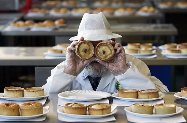
World Pie Championship jury member John Young poses with two scotch pies during the judging of the competition in Dunfermline, Scotland.

The World Pie Championship in Scotland is being judged by judge John Young in November to find a world pie champion and will be awarded The World Pie Making Champions for this year. Young is now looking at the pies to see if they are firm and will do this to every pie to be one of a hand-full judges to determine who is going to be a finalist in the final judging. 

2 - 

Balancing Elements - Putting the object on focus to one side and adding an object of "equal weight"  to the other side.

Rule of Thirds - Putting the focus of the picture to a point on a graph of thirds, no in the middle.

Leading lines - There is a long line head from on side of the picture to the other side and making it the object of focus.
Symmetry and Pattern - Making the whole picture able to split in to by a straight and with that fictional line make both side of that photo equal in every way that you can see.
Viewpoint - Putting where you will take your picture in to consideration. Over head, eye level, and ground level.

Background - don't use to much action behind the object in focus.

Depth - Make the the 2-D object look 3-D by add layer to your photo.

Framing - Put the object in focus in a condition where the object is frame by man or natural objects.  

Cropping - To get rid unwanted extras in the photos by cropping it to focus on the main show.

Mergers - Where a object is cut off by the frame and is left hanging on with what ever is left on the photo. What out when taking your photos.

3 - 

Aperture - Showing how much of the back ground is going the shown. A little or a lot.

Shutter Speed - How fast you want the picture to be and making the shutter to close fast or slow. Fast makes it take photos look as if they were stopped in time and vice versa.

ISO - To show how intense the camera is going to be in light.

4 - In my words, what is and isn't acceptable to the world. Making some look "meaner" by darkening the skin or make a group have only men, no women is NEVER acceptable to this world. If it's somethings as simply as changing a tooth in a newspaper photo or anything along those line is fine to a certain degree that many know.

5 - 

Environmental - Putting the angle towards the person and where there they are most comfortable spot like where they work or where their favorite place is.

Self - Only sharing themselves with a serious tone in the photo.

Causal - Taking a professional photo with the person in their everyday clothes.

Formal - wearing very fancy clothing and nothing like they are wearing their P-Js.

Informal - Were or looking like on their everyday route.

6 - 

Exposure - How much light is in one photo and is not to much nor to little light.

Depth of field - How much of range is in clear focus.

Focal length - How much zoom the camera can have be the length in lens to sensor by millimeters.

7 - 

Early Magazine Cover - Simply cover with nothing more than a picture and some text over it.

The Poster Cover - Only focusing on the picture for the cover, nor real blobs o texts.

Picture Married to Type - Has a model for the cover overlapping the title with the side to the models side.

In the Forest of Words - There might be a picture of anything, but all you see is a lot of text with to much happening on to even see what is going on.


Friday, December 11, 2015

Fashion's Dark Side

From Dove, a women was change by the a computer by the following:
  
- Smaller lips
- Longer neck
- Lower eye
- Smaller neck bone
- Larger eyes
_________________________________________________________________________________

In 33 seconds, the following changes were made:

- Darker skin
- Darker lipstick
- Thiner lips
- Smaller nose
- Skinner nose
- Larger eyes
- Broader shoulders 
- Shinier skin
- Less belly and breast fat
- Longer legs
- Smaller feet
- Longer arms
- Longer neck
- Lighter hair
- Lighter skin tone
- Smaller butt

_________________________________________________________________________________

In 3 + minutes, the following changes were made to a "larger" model in photoshop:

- Less fat everywhere
- Larger breast
- Rounder butt
- Rounder breast
- Smaller head
- Larger hair
- Longer hair
- Darker hair
- Messier hair
- Smaller hands, feet, and ankles
- Darker skin

-----------------------------------------------------Questions---------------------------------------------------------

1 - No because women should be happy with their body.

2 - Yes, like the "larger woman" having someone cane her body in a matter of hours.
  
3 - None to me.

4 - Fashion photography is when some takes a picture of the "hot" style of today, while photojournalism is taking photos mainly of the news, not the hot styles.

5 - Fashion can change what one where, says and looks, but photo-j. can shape ones opinion by what they see.

6 - To stop this from happening because we are the future of these industries. 

7 - I think it's because, in the fashion world, mens bodies are perfect and the woman's body can alway be improved. Larger this, smaller that, the cycle is endless in fashion.

Type of Magazine Covers

1 - Early Magazine Covers: The early magazine covers were mainly made of one simple picture with some text at the top and/or bottom. Sometimes, there might not even be a drawing and just be text, this was mainly for news magazine.

2 - The Poster Covers: These magazine nay had a large picture of what the win article is about. There is little text and is can also be in have a small subtitle in a corner. This was manly used to show face of some, or an animal, or a new discovery, no matter what it was used for, it was to share how a photo a made the headline that much better.

3 - Pictures Married to Type: The picture married to type is one that is mainly targeted to one part of society, women. A woman on the front of a magazine might mean beauty, style, or fashion, but people, no matter what gender can pick it up have a good read, learn a time management skill, or what not, anyone can read these magazines.   

4 -  In the Forest of Words: Every once in a while, you can pick up a magazine and have no idea what on earth is going on. The title is a large sentence, store names everywhere, and when you flip throughout the pages, ad are everywhere. The picture is covered by text and even other pictures, the only thing that might stick out is a small face with a bold font covering his body with the name of who is in the picture.

Wednesday, December 9, 2015

Thursday, December 3, 2015

My Favorite cover


At first, this made no sense to me. A picture of the ruler of Russia, Putin. Well dressed, well light, an over all good picture. One this that really struck me was the placement of the "PERSON OF THE YEAR" text was. It looks to be like if Putin was wear this Hitler mustache. An iconic symbol of bad to come and a harsh remake to a man who was thought to be invoke in the assassination of a competitor that my take his place as ruler. I pick this cover of how symbolic it was to a man half way around the world and is showed to be mock by a company that only knows his public side.

Cover of the Year

_________________________________________________________________________________
Key: 
         Formal = F
         Environmental = E
         Informal = I
_________________________________________________________________________________

1 - F

2 - F

3 - E

4 - F

5 - E

6 - F

7 - E

8- I

9 - F

10 - F

11 - E

12 - I

13 - I

14 - E

15 - F

16 - F

17 - E 

18 - I

Prompt Shooting

Purple Plant


Cold mold


Electric Art

Tuesday, December 1, 2015

Poster Brainstorming

1 - A darker cover. 

2 - To show at least some emotion on the magazine.

3 - Show more color, no black and white covers.

4 - Might use family.

5 - Show it like it was "real life."

Monday, November 16, 2015

Portraits tips


1. Hold Your Camera on an Angle

Horizontal and Vertical framings are not the only options when it comes to shooting portraits. While getting your images straight can be important in when shooting in these formats holding your camera on a more diagonal angle can also inject a little fun into your images.
This type of framing can add a sense of fun and energy into your shots. Just don’t ‘slightly’ do it or you’ll have people asking themselves if you might have mistakenly held your camera crooked.

2. Alter Your Perspective

Most portraits are taken with the camera at (or around) the eye level of the subject. While this is good common sense – completely changing the angle that you shoot from can give your portrait a real WOW factor.

Photographing your shadow is another way to do a self-portrait. Shoot early or late, when the sun is low in the sky. A light, stucco wall, a sidewalk, or any other simple background can suffice. Just be sure there aren't a lot of distractions around the surface you choose.
_________________________________________________________________________

The Environmental Portrait


I choose these photos because it shows people in there natural work place. A lumberjack and beginning rancher and cattle herder.


The Self Portrait


I choose these portraits because it shows how people as they see them self. That and the grey scale real helps the show a more details to me.

The Casual Portrait


I choose these portraits because the people in them look so natural in the pictures. _________________________________________________________________________________

 After looking at all of those pictures, I thing I might take picture of friends and family and anyone in that can be taken picture of in the time I have. I would go to an indoors to take pictures. I would make sure that all in focus.

Thursday, November 12, 2015

Loss and Love Photos

1 -  a sense of love to tragedy in the air. She lived such a short life and as I hit the last photos, I realized what had happen.

2 - The comment made me looked at the photos again and see how life was for these two.

3 - No, it take someone with years of experiences and training to reach in such a place.

4 - Live life if she was still alive.

Wednesday, October 28, 2015

The Park

1 - I would go to the Okpo Land theme park just because of how everything was left to rot. No one pick up the mess and tragic past this park had, only increasing the "spook factor" to me. Then other park I would go to is Shidaka’s Utopia with a camera in hand ready to shoot ghost. Yet, id the have spiders, no way in heck am I going to a place. No spiders, ever.

2 - 


3 - The five spooky places I would say to go and take pictures of are:

  • Very old graveyards
  • East Austin
  • Old Chuck-E-Cheeses
  • Junk yards
  • Factories 

4 - 
Junk yard

5 - My Grandpa loves collecting antiques and anything with a little rust on them. Every time I would go there, he would have a cool new antique waiting on the counter. I love seeing his awesome collections of toy cars, G.I. Joe toys, and even candy dispenser that had a coin stuck in it. This with a spooky vibe make me want to go see what lies in the junk yard. 

6 - Find the location, pack waters, hacksaw or bolt cutters, food, and a flashlight, go to location some how. Most likely via car. Break in on to most likely private property, take pictures, watch for shacks or homes with light coming from it, keep ears out, then get the heck out of there! 

Monday, October 26, 2015

The Old Comedy Gold


Local Granny raises funds to buy a pair a scissors on Kick-starter to save her beloved walker "Ferris" 
from the "terror" of light pole, and reaches $10 dollar goal yesterday. The Granny, who wants her name anonymous to the public, says that "Ferris has been more than a walker, he is my friend, and I love him", set up the Kick--starter with the name "Save Ferris" to try to rescue her "favorite grandson" in a time of need.


 Grandmother of 14 saves town from the "Rocky the Rapid Raccoon (R.R.R.)" by "360 no-scoping" the raccoon on her grandsons field trip to the Center City Zoo with a rifle. Known as "Xxx_Sweg_Granny420_xxX" by the Call of Duty community, she said in an interview that "the dank roadkill was ready to shank my fourth favorite grandson, so I just pull M.L.G. gun and kill the noob",but the Grandmother ended up getting arrested  for having weed on her.

In loving memory of Rocky Raccoon. Father, brother, mascot of Center City Zoo. Rest in poop.


Sisters Olga and Hippatippa go missing while walking their two nurse sharks last Friday at the local bay. Leaving 25 and 1/2 Catfish homeless, the "Crazy Catfish ladies who smell like stink-bait" were last seen at 4:20 pm by this photo, the Grannies last known words spoken were by Hippatippa "I'm going out with my sister to get ice cream, see you later alligator".

Thursday, October 22, 2015

Christian Ruhm's Awesome Pictures

1 - My reaction start with the "what the?" effect, then started thinking "how did he do it?".

2 - Triple exposure by the camera.

3 - To me, the The statue of Jesus in Rio, Brazil.


______________________________________________________

25 Painting Every Photographer must Study

1 - 

2 - 

3 - 


Academic Post-Shoot Reflection


1 - Used simplicity and rule of thirds.

2 - The girl's head, not her drawing because it is being hidden.

3 - To me yes.


1 - Balance

2 - The girl to the left doing homework.

3 - Some might go for the boy on to the left, not to the girl.

4 - Focus on the girl more than the boy.


1 - Lines, rule of thirds, and simplicity.

2 - The girl drawing the landscape.

3 - To me, yes.


1 - Rule of thirds and balance.

2 - The Boy in red smiling.

3 - The boy in blue would confuse some, but it looks like the boy is most likely were many's eye would go.


1 - Simplicity, balance, and good ol' rule of thirds.

2 - The boy reading to the left. 

3 - Very.

--------------------------------------------------------------------------------------------------------------------------

Post Shoot Reflection 

1 - Getting into classrooms. Many rooms were giving lessons and were not doing anything "stop and work" related. When I did go into a classroom, I used all my time I had in there.

2 - Focus for me. I just keeper on thinking "Am I going to get in focus" or "Did the last one I take in Focus enough".One example was when I was doing an over head and the first to photos were blurry, I did my hardest to take good photos in focus, and I did get her focus, but after the final picture, I scraped the picture for another one.

3 - To add more lines and less rule of thirds and go for something different.

4 - The pictures of people studying and drawing outside.

5 - Hopefully simplicity and more lines. I like lines.

6 - Balance.

7 - Balance.

--------------------------------------------------------------------------------------------------------------------------

Academic Shoot with Nick's Blog


Pros - Nick's photos were very simple in nature, yet gave a vibe of more, something hidden in the photos. A photo with a story is super good to have for me. Also how you incorporated the good ol' rule o' thirds in each of the pictures is fantastic to have.

Cons - How some of the pictures are a little to dark is hard to see far away, even with my screen on full brightness. Just a tip. No hard feelings.

The Three Pillars of Photography

Aperture - 


Photo of flowers on f/16. 


Photo of small wagon at f/2.6.

1 - The eye and the cornea.

2 - The smaller the aperture, less background you see ,and the larger the aperture, the more background you see.

3 - The more objects in the background can make the average background turn in to one plane. Like if the object that you looking is a wheel, but the truck is making up the photo.

Shutter Speed - 

Super high shutter speed

Low shutter speed


In the light at hot-dogs and bulldogs-

1 - 1/250

2 - 1/50

3 - 1/2000

4 - 1/75

5 - 1/50

6 - 1/1500

In the dark at hot-dogs and bulldogs-

1 - 1/10

2 - 1/1

3 - 1/100

4 - 1/250

5 - 1/1

6 - 1/50

------------
Aperture priority - you set aperture, the camera does the rest.

Shutter priority - you set shutter, the camera does the rest.

Manual - you set both aperture and shutter speed.

_________________________________________________________________________________

ISO - 

High I.S.O.

Low I.S.O.

1 - To give the player the main focus of the picture, not the crowd nor lights.

2 - To use a lower I.S.O. in places with lots of light already, so put it around 100 to 200 I.S.O.

3 - To use a higher I.S.O. when in low light environments and to also use it in times of freeze frame moments.

------------

1 - Aperture: 2.8 to 20

2 - Shutter speed: 1 second to 1/4,000 second

3 - I.S.O.: 100 to 256,000


Monday, September 28, 2015

The Story


Best Story


This Photo came with no real story, yet packs more than a 1000 words. I believe that someone the school died, student or staff, and the students are remembering with a moment of silence. 

Emotion

As they always say, theirs always that one, and in this case, there are two. This teacher, trying to work, has his hands full with two student that might be family greeting there favorite teacher. All of them with work to do, but a smile one there face.

Most Interesting 

Science is many people's number one best class of the day, but things just got better with this awesome experiment that the made. The fog is what makes this photo and everyone seeming to be happy, they student wouldn't forget this lab in a long time. 


Part 2: ISSUU 2012  Photo Contest Winners

Photo name: Junior Year - It's a overhead, black and white picture of a junior boy in a library hall reading a book with many other books, magazines, and paper scattered in front of him.

1 - I choose this picture because this is just like me, doing one this with tons of work in front of me waiting to be done.

2 - Lines by the books on the shelfs, framing by the two shelfs, balance by the equal amount of books in front of him, and simplicity from the basic like design of the photo.

What to do Next Class

1 - Science class.

2 - Mrs. Spiro or some other science class.

3 - Keep photography rule in mind look for pictures with color.

Photo Manipulation and Ethics.


April fools day is fun, but if you make the joke a joke, then people get mad over happy. In 2009, a photo of the Israel' anew cabinet was made to look as if it had only men, not the other female ministers in the photo, causing backlash. This is apart of a number of photographers editing their photos for wrong purposes. From award-winning veterans, to even simple photojournalist, many are trying to cut corners the easy way.

I think that editing photo for the wrong purpose is never right. If you edit for something like Youtube to make a thumb-nail, that's find, but if you job is to tell the news, that's not right.


To me, this is the most unethical picture because he's not "menacing enough" means to darker his picture is just wrong.


Te me, changing a few teeth t make someone look "better" really isn't that bad. If it was the body getting skinnier or making a model would be much worst to me.

Thursday, September 24, 2015

Great Black/White Photographer 2

        Eugene Smith was Born in December of 1918, was taken picture by 15 for the local newspaper.
He Went to Notre Dame University, but left to go to New York City to New York Institute of Photography. In 1937, Smith was a freelancer photographer, until 1943, where he took some of his most remembered photos. Working for Life magazine, he was in the middle of invasion in Japan and only had is camera and a knife. He survived, yet since he said he that never wants to come back to Japan, ever. He came back and lived out his life and died in Arizona in 1978.

http://www.iphf.org/hall-of-fame/w-eugene-smith/

http://www.magnumphotos.com/C.aspx?VP3=CMS3&VF=MAGO31_10_VForm&ERID=24KL5347YF


Friday, September 18, 2015

Post Shoot Reflection

1 - Challenges:

Out of all of them, Medal was the hardest for me to find. All the one's I wanted were being taken by other students, and when I came to throne that I wanted, I needed a chair to get up. It took the most time out of all of the pictures I took that day. I finally found my medal picture, but I needed a chair. After 10 minutes, I finally got my shoot.

2 - Thoughts:

My main thought over the project was framing. Mind head was mainly focus on how the photo will look out in the computer, not in my head. To Me, I only what going  to be in the photo, not the background.

3 - What'd I do Different

If I could this project again, I would do the medal picture, take less pictures not taking a million, and not taking to much time.

4 - What'd I do Again
Take the same happy, square, and Bowie picture the same. That's it.

Post Shoot Reflection

Emanuel - http://emanuelphotojournalism.blogspot.com

Emanuel's pictures used some of the rule of thirds, simplicity, and framing. He also used idea I didn't think when shooting and used a steady hand, unlike me.

On the other side, some of his picture make little sense, he might have'd my ideas, and one is so blurry, I didn't know what it was.

Wednesday, September 16, 2015

The Six Rules of Photo Shooting 


1- Simplicity


Shows only the doomed man falling and the tower, nothing else. 

2- The Rule of Thirds 


After both towers were hit, the photo was taken displays the rule of thirds with the tower as the object in thrids. 

3- Lines


The main lines in this picture are the tower's borders coming down.

4- Balance

The Balance of the columns in the light creates a even balance.

5- Framing

The row of buildings make an artificial frame for the man on ground zero.  

6- Avoiding Mergers

The road, sign, and long line of people are all cut off in this bad crop.
5 Shoots

 Square


 Medal

Used Lines


BOWIE!

Used Simplicity


Happy

Used Rule of Thirds

Merger

Didn't use avoided mergers